Top-Rated Wedding Website Builders by Couples Online
Couples rate wedding builders on whether they handle logistics, not just looks.

Wedding websites used to be a nice-to-have, something the design-conscious couple added for fun. Now they're the logistics hub for the entire event, the one place guests go to find the venue, the schedule, and the RSVP form. Couples rate these builders on whether the thing held up under real conditions, on a real phone, from a real aunt who last updated her apps in 2019.
That shift changes what "good" even means here. A wedding website has to do four jobs at once: tell guests where and when, collect RSVPs and dietary needs without forty phone calls, cut down the same three questions asked eleven times each, and stay updatable when the caterer changes the menu two weeks out. That's logistics wearing a nice outfit.
Australian couples run into one extra snag. A lot of the big global platforms assume a US phone number, US pricing, sometimes a US-only vendor directory. That friction shows up fast, right at the RSVP form, when a mobile number won't format correctly and a guest gives up halfway through. It's a small thing until it happens forty times.
The three things that keep appearing in high ratings across platforms
Look across enough reviews and the praise doesn't scatter. It clusters around three things, over and over, regardless of platform.
First, setup speed. Couples want something that looks finished after one sitting, not a multi-day design sprint with three tabs open and a colour wheel. Templates that ask for a photo and a palette and nothing else tend to get praised; open drag-and-drop editors get mixed reviews from couples who aren't designers and don't want to be. If the first twenty minutes feel easy, that builder gets passed around a friend group by word of mouth, which is still the best advertising there is.
Second, guest usability, meaning: does it work for your uncle. Wedding guests skew older and less comfortable with apps than the couple building the site, so mobile layouts that don't demand an account or a password get cited as a relief. RSVP forms that fail to confirm submission, or that quietly break on a phone browser, generate complaints that land right back on the builder's rating. For Australian weddings specifically, support for local phone numbers (without auto-correcting to a US format) removes a real point of friction.
Third, and this is the one that separates the tools couples merely tolerate from the ones they actually recommend: connection to the rest of the planning process. When an RSVP populates the guest list on its own, when a dietary tag follows that guest into the seating chart without anyone retyping it, couples describe the whole process as calmer. When the website sits off on its own, disconnected from everything else, couples end up re-entering the same fifteen names into three different spreadsheets, and that's exactly where mistakes creep in.
Australian reviews add a fourth thing worth naming: local relevance. Whether the platform understands an Australian wedding, its venues, its seasons, its logistics, rather than treating the country as an afterthought bolted onto a US product.
Builders couples actually name when they recommend one
A few names come up again and again, and they're worth looking at on their own terms.
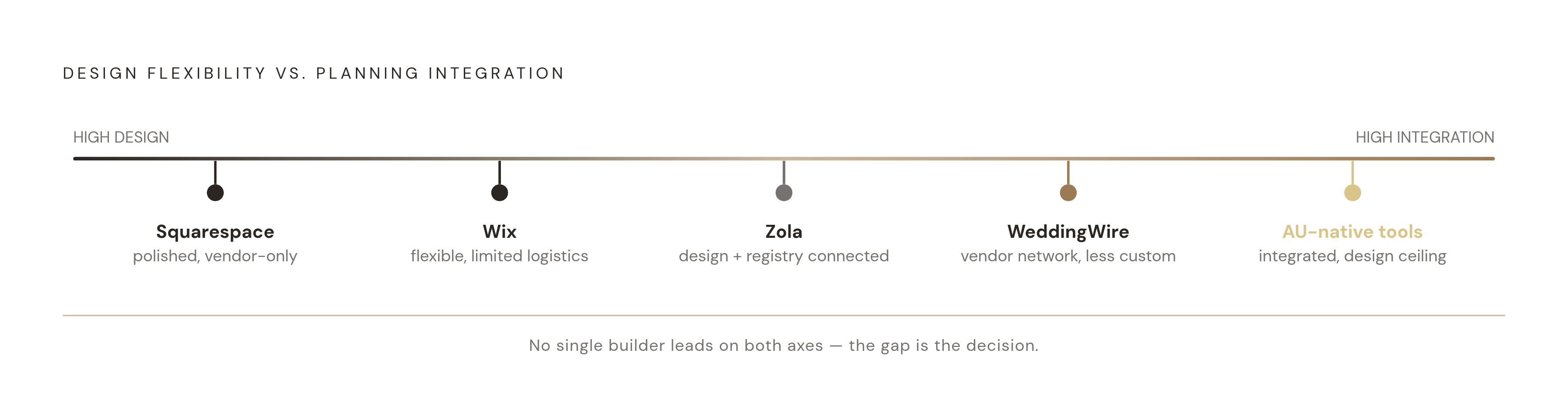
Zola gets consistent praise for design quality. Its templates look premium without requiring any design skill from the couple, and its registry integration means gifts and website live in one place. The catch for Australian couples: the registry side is built around a US shopping experience, so while the website builder itself works fine locally, the wider ecosystem assumes an American context.
WithJoy shows up often in roundups as a clean, low-effort setup option. Guest usability tends to score well; it's just not as tied into the rest of the planning process as some alternatives.
Squarespace draws couples who want visual impact and don't mind treating this like any other website project. The design ceiling is genuinely high; a couple with some design instinct can build something distinctive. The trade-off is that there's no wedding-specific planning layer underneath it, so RSVPs and guest lists mean bolting on a third-party tool or tracking things by hand. It's also a recurring subscription, not a one-off cost.
Wix works similarly: drag-and-drop flexibility, beginner-friendly templates, built-in RSVP and countdown widgets, solid photo galleries. Like Squarespace, it's a general-purpose builder adapted to weddings rather than built for one, so the planning connection stays limited.
There's also a category of Australian-native tools built specifically around local phone number formats and local vendor directories, some of which bundle the website with a guest list, seating chart, dietary tracker, and budget planner as one connected system, priced as a single payment rather than a monthly fee, Wedbuild, a self-serve wedding organizer for couples, is one example of that model. For couples who resent paying a subscription across a two-year engagement, that pricing model alone is worth a look.
Where each builder fits — and where it falls short
No single builder wins on all three criteria at once; that's really the whole story here. The right pick depends on which failure mode a couple would rather live with.
If speed and visual polish matter most, and the couple is fine handling guest logistics as a separate task, Zola or Squarespace both get the job done quickly. Squarespace asks a bit more design confidence of the couple; Zola hands you more of the decisions pre-made.
If the wedding itself is complicated, with a welcome dinner, a ceremony, and a reception spread across different days or even different guest lists, look for a builder built around multi-event RSVP segmentation specifically, since that's a feature general-purpose builders simply don't offer.
If local relevance matters (Australian phone number support, a vendor directory that isn't just a rebadged US list), the Australian-native options close that gap in a way the global platforms haven't caught up on yet.
The trade-off worth saying out loud: the builders that score highest on design flexibility tend to score lowest on planning integration, and the reverse holds too. A couple gains creative freedom with Wix or Squarespace and gives up the connected logistics; a couple gains the connected logistics with a wedding-native tool and gives up some of that design ceiling. Neither is wrong, and it's a decision worth making on purpose instead of by accident.
What the website actually needs to contain for guests to rely on it
A gorgeous site nobody actually uses is a failed site, full stop, regardless of which builder made it, and content is what brings guests back to check something twice.
Some things are non-negotiable: the date, the ceremony start time, the venue address with an actual maps link rather than just a venue name a guest has to Google themselves. If the reception is somewhere else, say so, and explain the gap in timing so nobody's standing around confused at 4pm. State the RSVP deadline plainly, with one click to the form, not three, and put parking or transport information somewhere obvious, because that's often the very first thing a guest looks for, before the schedule, before anything else.
A second layer of content cuts down on the day-of questions that otherwise land on the couple's phone at 7am. A dress code stated in real terms, not a vague adjective like "elegant" that means five different things to five different guests. Accommodation suggestions near the venue are especially useful for anyone travelling interstate or from a regional town, alongside a loose outline of the day, not minute-by-minute, just enough shape that guests aren't anxious about when things start and stop.
The RSVP form itself deserves as much attention as the rest of the site combined. A yes/no field for dietary needs misses almost everything real; it needs to be free text or a proper multi-select. A confirmation message on submission stops guests from calling to check whether it went through, or worse, submitting twice, and the mobile version should be tested on an actual phone before the invitations go out, not after the first complaint comes in.
For the handful of guests who won't touch a website no matter what, a printed insert with the URL and a QR code catches most of that gap. For very small or casual weddings, a private group chat can carry the same information without needing a builder at all; the tool serves the planning, not the other way around.
How the website-to-seating handoff is where most planning stress concentrates
Here's where things usually go sideways. The RSVP form is the exact spot where couple-facing planning stops and venue-facing logistics start, and that handoff is where most of the stress in the whole process piles up.
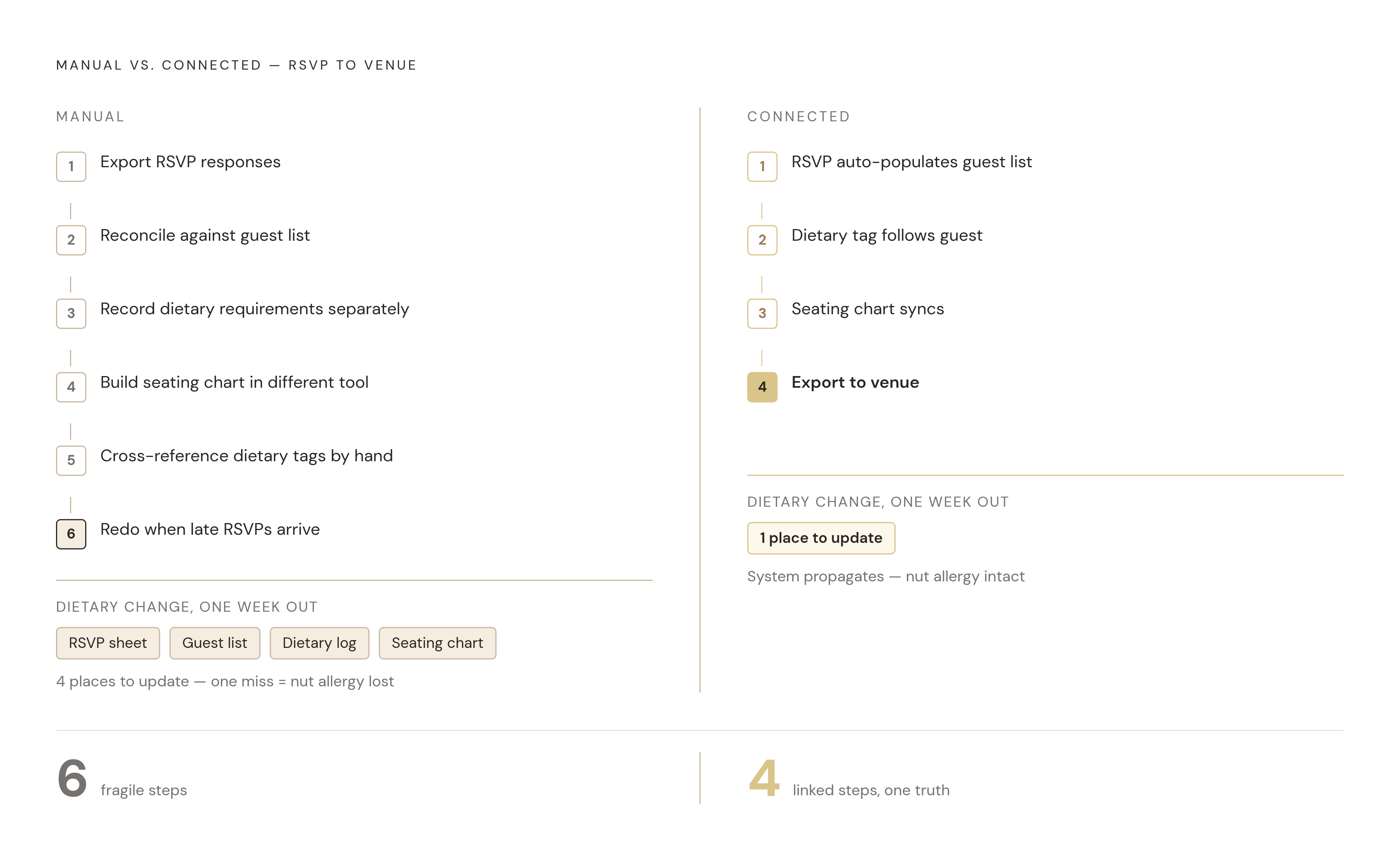
The manual version looks like this: export the RSVP responses, reconcile them against the guest list, write dietary requirements down somewhere else, build a seating chart in a completely different tool, cross-reference the dietary tags by hand, then redo half of it when three late RSVPs land the week before the wedding. Every one of those steps is a chance for a name to get misspelled, a nut allergy to vanish, or a table count to come out wrong at the worst possible moment.
Some tools cut this down. Zola's seating chart syncs with its own RSVP data, so couples can drag guests into tables and export a print-ready layout straight to the venue. WeddingWire does something similar, auto-syncing its seating tool with its guest list within the same platform. For couples whose website and seating tool live in separate products, free standalone tools like planning.wedding or SeatPuzzle work with any venue layout and don't require switching platforms.
There's a simple test for how connected any of this actually is. If a guest RSVPs the week before the wedding and changes their dietary requirement, how many places does the couple have to go update it? One place means the system works, and four means it doesn't, no matter how nice the homepage looks.
How to choose based on where you are in the planning process
The right builder partly comes down to timing: where the couple is sitting in the engagement changes what actually matters.
More than a year out, prioritise a builder whose planning tools grow alongside the process, guest list, budget, vendor comparisons, rather than one that only ever produces a website. Switching later means re-entering RSVP data and rebuilding content from scratch, so choosing once, and choosing something connected, is worth the extra hour of research now.
Six to twelve months out, the website should already be live, since save-the-dates are pointing guests to it. If the current setup is a pretty site plus a spreadsheet running in parallel, this is the moment to consolidate, before RSVP volume picks up and the spreadsheet starts falling behind.
Under three months out, switching builders creates more risk than it solves. Better to check whether the existing site actually has everything guests need for the day itself, since the real pain points at this stage are seating and dietary reconciliation. Standalone tools like planning.wedding or SeatPuzzle can handle that even without touching the website at all.
The clearest sign a builder choice is working isn't a compliment about the font. It's when the couple stops thinking about the website as a task on a list, and starts treating it as something they and their guests both just rely on, the way you'd rely on a light switch, without a second thought.