Wedding Website Design Examples From Real Couples
Real couples show what actually works—and what guests will skip.

A wedding website is the one piece of wedding planning that guests actually see. Everything else, the spreadsheets, the seating charts, the group text with your florist that's somehow 400 messages deep, happens behind the curtain. The Knot put the number at 78% of couples using online planning tools in 2024, and that tracks with what I've watched happen over the past several years: the site became the storefront while nobody was really paying attention.
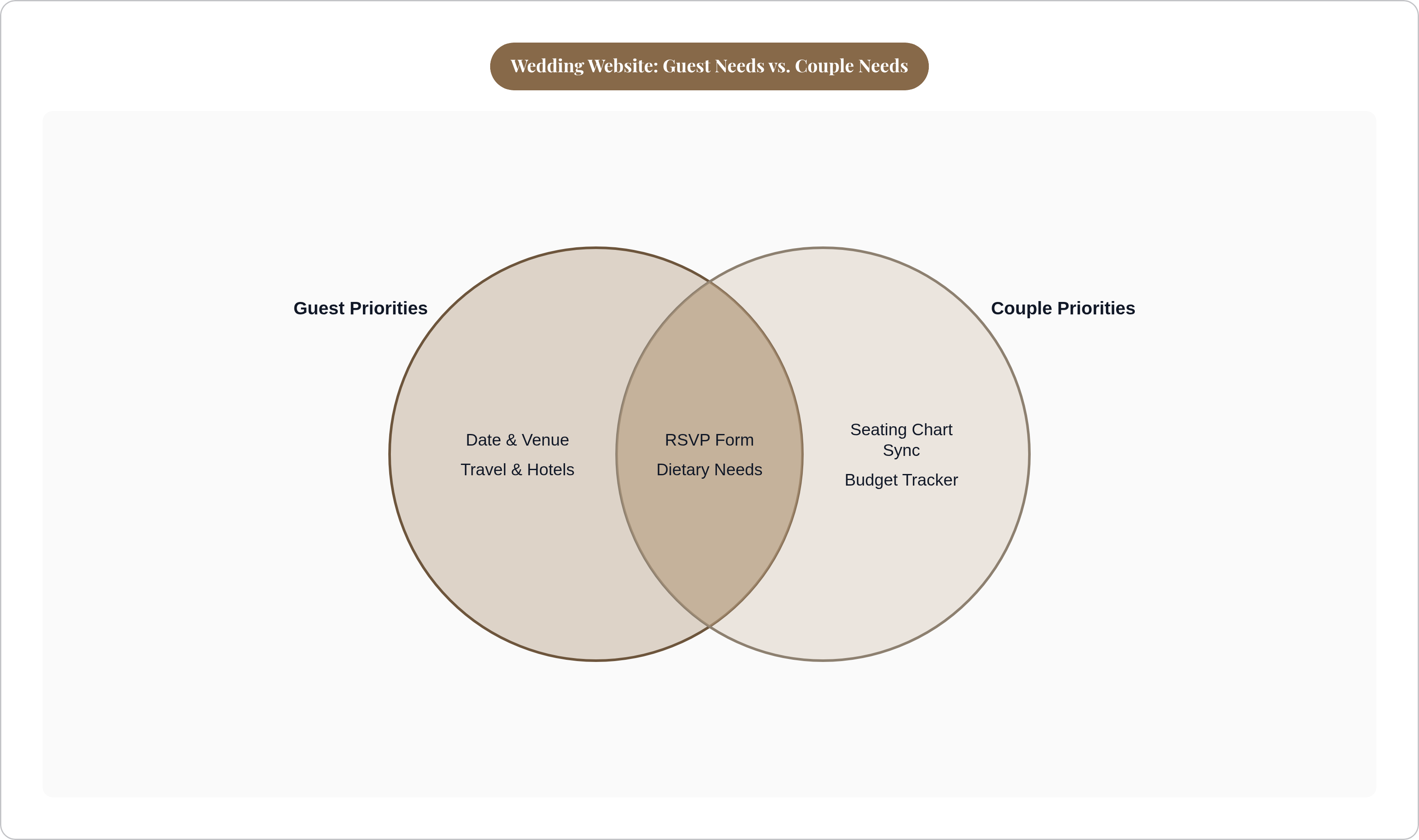
Here's the part that trips people up. The site has two audiences, and they want completely different things from it. Guests want speed: date, location, what to wear, where to sleep. Couples want the opposite direction of traffic, RSVPs, dietary needs, that one cousin's plus-one, flowing back in without anyone drafting a follow-up email. Build for only one side and you end up with wallpaper that happens to have a calendar widget on it.
What follows comes from looking at actual couples' sites, page by page, and noting what held up once real guests started clicking around versus what just looked nice in the planning phase.
The core pages most guests will actually look for
Some pages aren't optional. Date and venue, RSVP, travel and accommodation, a day-of schedule, registry. Cut any of these and you're fielding the same three texts for six months.
Past that baseline, the sites that go from "fine" to "actually useful" tend to add an FAQ, local recommendations, and a note on dietary or accessibility needs. Small additions. Big payoff.
Navigation does more work than people give it credit for. Mary Jo and Adam, planning a Chicago wedding, put RSVP in its own spot on the right side of the nav bar, physically split off from the pages people browse for fun. Anyone who needs to act finds the button in about two seconds, no hunting.
The FAQ page deserves more respect than it gets, too. Done right, it answers the ten questions every couple otherwise fields one by one over text: dress code, parking, kids or no kids, can Uncle Ron bring his camera, does the plus-one policy apply to him. George and Tarini took it further. Their multi-day Indian wedding included FAQ content walking guests through what a Ganesha Puja, a Haldi, and a Mehndi ceremony actually involve, for anyone who'd never been to one. That's not decoration. That's hospitality.
Registry links belong somewhere quiet, a dedicated page or a footer, not the headline act. Nobody wants their invitation to feel like a bill.
How aesthetic choices signal what kind of wedding guests are coming to
The look of a site is the first impression of the wedding, and guests read it before they read a word of copy.
Three modes show up again and again. Classic and clean leans on strong type, restrained color, and white space, letting the couple's own photos do the work instead of a busy template. Tropical and botanical uses foliage as a frame rather than a competing backdrop, and it works best when the venue itself has greenery to back it up. Floral spans a wide range, from soft pastel garden party to oversized, moody blooms, and the right call follows the venue's actual lighting, not a Pinterest board assembled six months before the venue was even booked.
Shawn and Tara's mountain retreat site ran cream and deep green with soft wave shapes between sections. You know it's a weekend in the woods before you've read a single line of the schedule. Mary Jo and Adam did something equally efficient with one big hero photo of the Chicago skyline, location and energy delivered in a single image, no caption needed.
If there's a rule buried in all this, it's that the site should preview the actual event, tailored to this couple, not lifted from a generic template. Stuck deciding? Go classic and clean. You can always dress it up later. Walking back an overly busy theme once guests have already seen it is a different problem entirely, one that's not fun to solve two months out.
What the hero section does — and what couples get wrong about it
The hero section is the one part of the site every guest sees, whether they stick around for three minutes or three seconds. It has to answer who, when, and where before anyone scrolls, with names, date, location, and one strong photo as the bare minimum.
The couples who get it right go a step past that floor. Emily and Manuel put a "2,994 days" countdown right above the fold, oddly specific in a way that tells guests instantly this wasn't a quick engagement, it was a long haul worth marking. David and Emily built a custom autumn forest header with wedding rings hidden in the pattern, a detail that rewards a second look without crowding the essential information. Nhi and Andrew went full cartoon, illustrated versions of themselves as the hero image, setting a warm, funny tone before anyone's read a line of copy.
The common failure is a hero image that's technically pretty and says absolutely nothing: stock-photo mountains, an over-filtered sunset, a shot that could belong to any couple in any decade. Beautiful, and mute.
There's a practical cost too. A slow-loading hero raises your bounce rate before anyone reads a word, which is an expensive way to show off a nice photo. Test it on a phone, since hero sections built for a wide desktop screen have a bad habit of collapsing into a mess on mobile, which happens to be where most guests are actually looking at it.
Telling the couple's story without losing the guest along the way
The love story page is the most human part of any wedding site, and it resists templates, which is exactly why it's where sites either come alive or go flat.
A few formats hold up. A timeline works when the relationship has a clear arc: met here, traveled there, proposed on that specific beach. Courtney and Jesse structured theirs as a Q&A, which turns out to be a smart move for anyone reading on their phone in three-minute stretches between meetings. Eilish and James just embedded their proposal video on the welcome page. Fair enough, video conveys in fifteen seconds what three paragraphs would strain to say. Poem or short prose can work too, but only if the writing is genuinely good; a mediocre stanza is worse than four honest sentences.
Skip the wall of undivided text. Skip cramming in every date since 2016 like it's a legal deposition. Skip the tone that reads like a press release ("the couple met at a mutual friend's gathering") when what actually happened is your dog got loose at a barbecue and Manuel chased her down the block. Tell that story instead.
Guests will read something that takes two or three minutes. They'll skim, or skip outright, anything that reads like a memoir. This page is quietly doing double duty anyway: it tells guests how formal or relaxed the day will be before they've even scrolled down to the dress code.
Guest logistics pages — travel, maps, and local recommendations done well
Travel and accommodation pages pull more guest traffic than almost anything else on the site, and they're often the laziest page couples build. An address and a limp "there are hotels nearby" isn't a plan. It's a shrug with a hyperlink.
The couples who put in the work make it obvious. Nhi and Andrew built a curated Google Map pinned with restaurants, pubs, hotels, and the venue itself, so guests land in town already knowing where to eat, not just where to sleep. Shawn and Tara introduced their venue, a 104-acre redwood forest property, and broke the weekend down by time, location, and attire for each event, so guests could pack correctly instead of guessing. Mary Jo and Adam gave "things to do in Chicago" its own spot in the nav bar, treating out-of-towners like visitors who deserve a real guide instead of an afterthought.
Multi-day and destination weddings raise the stakes considerably. George and Tarini gave each event of their multi-day Indian wedding its own page, complete with the customs, the attire, and the timing spelled out. Guests flying in from overseas had everything in one place instead of piecing it together from a group chat with forty unread messages.
Worth including, every time: hotel block info and the booking deadline, transport options, where to park or get dropped off, the nearest airport, whether rideshare even works out there. A guest confused about how to reach the venue doesn't suffer quietly. He calls you, probably at a bad time, and the entire point of this section is making sure that call never happens.
Personalisation techniques that give a site its own character
Most wedding sites run the same handful of pages. What separates the ones people remember from the ones forgotten by dinner is personality, plain and simple.
A few approaches actually land. Custom illustration, the route Nhi and Andrew took, and James and Anne-Lise too, sets a playful tone and carries through nicely to invitations and stationery. Interactive elements work: Sarah and Stephen tucked a pop quiz about their relationship below the fold, and guests who played it showed up to the reception already armed with conversation starters. David and Emily added a Spotify playlist for the drive to the venue, small and thoughtful, filling dead car time while previewing the night's soundtrack. Emily and Manuel's "2,994 days" works precisely because it's specific. Round it to "about eight years" and the charm evaporates.
Personalisation works when it's true to the couple, not quirky purely to be quirky. It also has to match the tone you've already set visually. Cartoon illustrations bolted onto a black-tie, candlelit, string-quartet site creates a strange kind of whiplash for anyone scrolling through it cold.
The RSVP form — where design and data collection have to work together
Every other page on a wedding site broadcasts outward. The RSVP form is the one page built to listen.
A well-built one captures more than yes or no. Dietary needs specific enough for a caterer to act on, not "some allergies maybe." Song requests. Menu selections, if the reception calls for them. Plus-one names. And accessibility needs, which almost no wedding site asks about directly, but guests with mobility or sensory needs notice immediately when a couple has thought ahead for them.
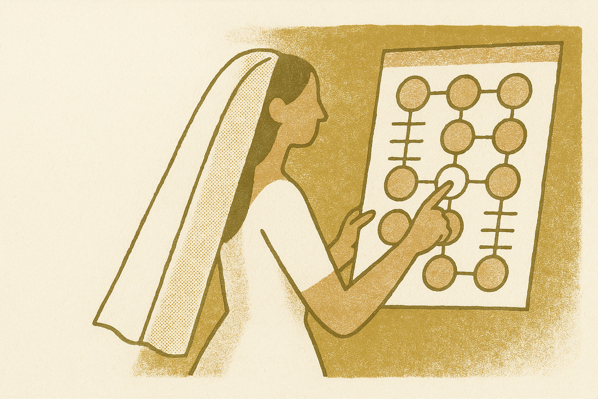
Here's where it usually goes wrong, about two weeks before the wedding: RSVP data sits in one place, the seating chart sits in another, the caterer's headcount lives in a third. Reconciling all three by hand at 11pm the week of the wedding is exactly where mistakes creep in. Someone's peanut allergy gets missed. Someone's gluten intolerance never makes it past the spreadsheet it was typed into.
The fix is connection, not more spreadsheets. When dietary data collected at RSVP flows straight into the seating chart, a guest's allergy shows up at the table level automatically instead of sitting in a tab someone has to remember to check. And the earlier pattern holds here too: couples who gave RSVP its own prominent spot in navigation, like Mary Jo and Adam, ended up with a noticeably cleaner guest experience than those who buried the button at the bottom of a long scroll.
How the site fits into the broader planning system — and where standalone sites break down
Something like 90% of wedding planning now happens online, which means the website was never really a standalone object. It's one node in a bigger digital system, whether the couple set it up that way on purpose or stumbled into it.
The common failure goes like this. The couple builds a genuinely nice site. Guests RSVP, dietary needs get logged, headcounts update, but that data lives in one tool while the seating chart, the budget tracker, and the vendor list live somewhere else entirely. The same information gets typed in three separate times, and version-control errors creep in as the date closes in. Couples report spending something like six hours a week managing logistics, and most of that isn't decision-making. It's re-entering data that already exists somewhere else, just in the wrong tab.
An integrated system flips that around. The guest list feeds the RSVP form, and RSVP responses update the guest list automatically, no copy-pasting required. Dietary data moves straight from RSVP to seating chart to caterer brief. The budget tracker reflects a vendor deposit the moment it's paid instead of waiting for someone to remember three weeks later.
The takeaway holds regardless of which platform a couple picks: a site that looks right and works right only gets you halfway. Every design choice covered above matters most when the data behind it actually goes somewhere, instead of dying quietly in a form nobody checks again.